It was a Friday evening at The Knights of Unity office, last weekend of January. The long-awaited game-jam event was about to start. Our team registered 3 participants: Sir Nolaloth, Sir Michael and me – Sir Koshik.
Sir Nolaloth asked one more time:
- You won’t ditch us like you did last time, will you Koshik?
- Just let me check one thing in Scythe and I’ll be back to jamming full speed – I answered.
48h later my team presented a cool FPS game where the player wanders through an old castle and fight skeletons with magic. My contribution to the app was around 0.0%.
I didn’t even show up at the finals. Instead, I looked one last time at the new shiny dropdown list before hitting git commit button:
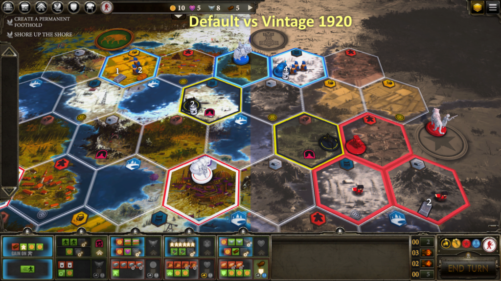
Default, Doom & Gloom, Moonlight, Black & White and my favourite Vintage 1920.
I… just…. couldn’t leave it unfinished.
My precious.
My name is Marcin Koszów [Koshik], I’m Scythe: Digital Edition dev lead and I’d like to tell you about the feature that you’re unlikely to find in other games: Dynamic Map Colors.
Token Visibility – those 2 words have haunted us from the start.
Scythe allows dozens of pieces to be placed on a single territory. That’s a lot of fun when you’re playing a physical game but becomes a real challenge when you want to show it all on a 2d screen and make it readable for everyone. Moreover, the map is full of details and it makes it extra hard for small pieces to stand out.
In order to tackle that together with Asmodee Digital UX team we decided to explore 3 directions:
- Territory layout
(place the smaller pieces in front, pack the units as tight as possible, etc.) - Tokens textures & shadows
(emissive textures, exaggerated shadows) - Map texture
The last one turned out to be quite a journey.
First thought was to replace the map with a custom-generated terrain. This, however, made the game lose its spirit and decision was made to stick with the original board texture.
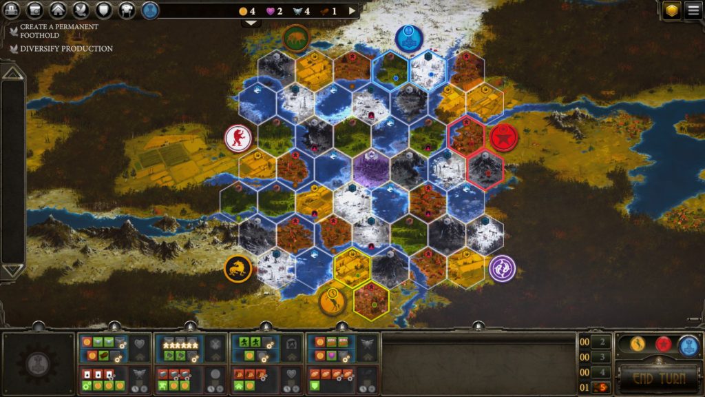
Sir Adam (our tech art dev) came up with an idea to colour each territory basing on its type. His prototype looked beautiful and resembled a stained-glass window from a distance. It worked great for the far strategic view, but we needed something subtler for close-ups.
I took Adam’s shader and started playing with the parameters – the results were promising. 2 angry game jam buddies later I came up with 4 presets that were toning-down the map in various ways while maintaining its complexity at the same time. The base colouring formula is fairly simple:
targetColor * (input.r + input.g + input.b) / 3
The rest is about blending the output with original texture & applying adjustments to brighten or darken the final colour.
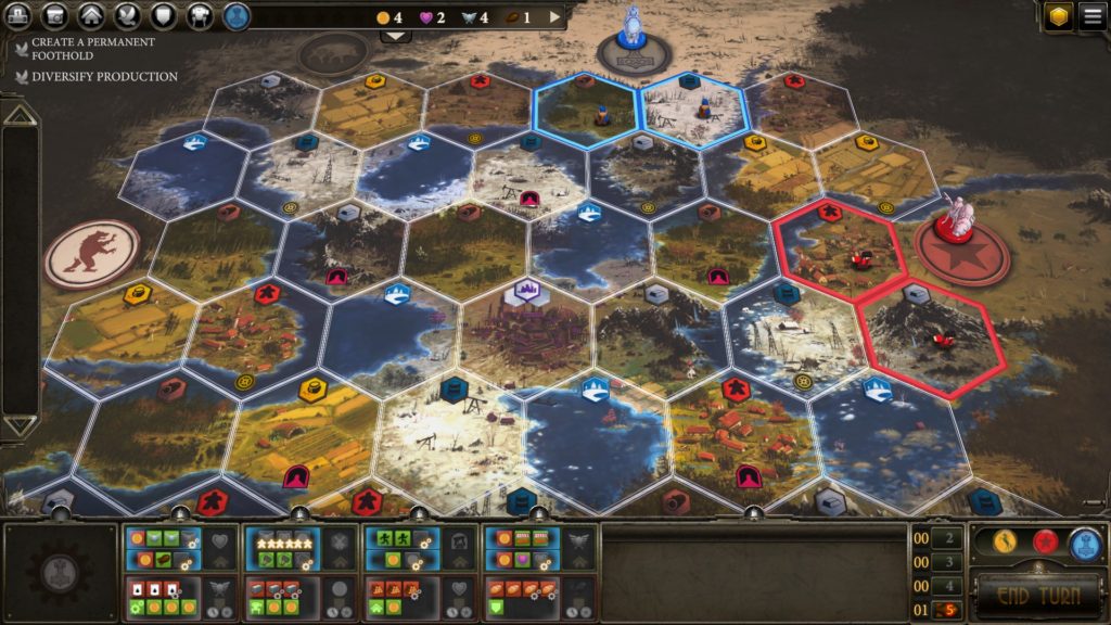
The initial version of Map Coloring feature was static only. It was Asmodee Digital (the publisher) who suggested adding the Dynamic mode – apply the filters only at some distance. Initially sceptical, I’ve added the distance weight adjustment to the equation and it clicked!
In the meantime, the updates we’ve done to unit models aided close-range visibility problems, so the Dynamic Map Coloring could kick in only when needed – during mid-range zoom. Hex-type colouring shows up towards full zoom-out (both effects turn out to compose well together). Moving the camera all the way from the close-up to strategic view became quite a rich experience. All colour transitions happening smoothly so that they won’t distract you from the game.
It took some effort, but I’m happy we’ve managed to solve the unit visibility while staying faithful to the map design. As an extra perk, we’ve got a nice visual effect where the map colour gradually shifts towards the horizon:
There’s more to it though. I believe this technique has a bigger potential.
Imagine a game where the world is grey and your aura makes it colourful again!
Or, on contrary, as you get close to objects, they smoothly turn old and decayed.
You could also make a mirage experience where things just disappear in your presence. Going down the psychedelic alley: some things could change/disappear and some might not.
I’m definitely going to explore these ideas after Scythe is released!


