Working on the design of Little Racer required a lot of flexibility. There were many areas on which the designer had to work on – creating documentation, designing worlds, obstacles, levels, cars, creating all the names in the game, i.e. names of levels, cars, achievements, co-operating with artists, working on the balance of the game – creating conditions for achievements and all unlockables, working on the UX of level editor… Each week was a new challenge, what made us fully engaged in the project and never bored! 🙂
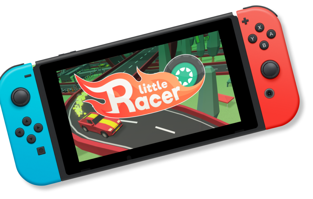
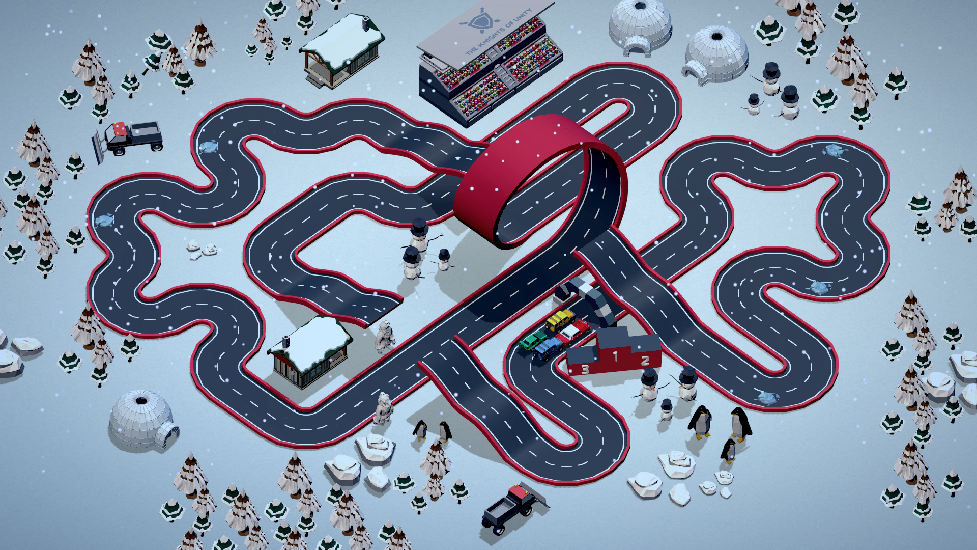
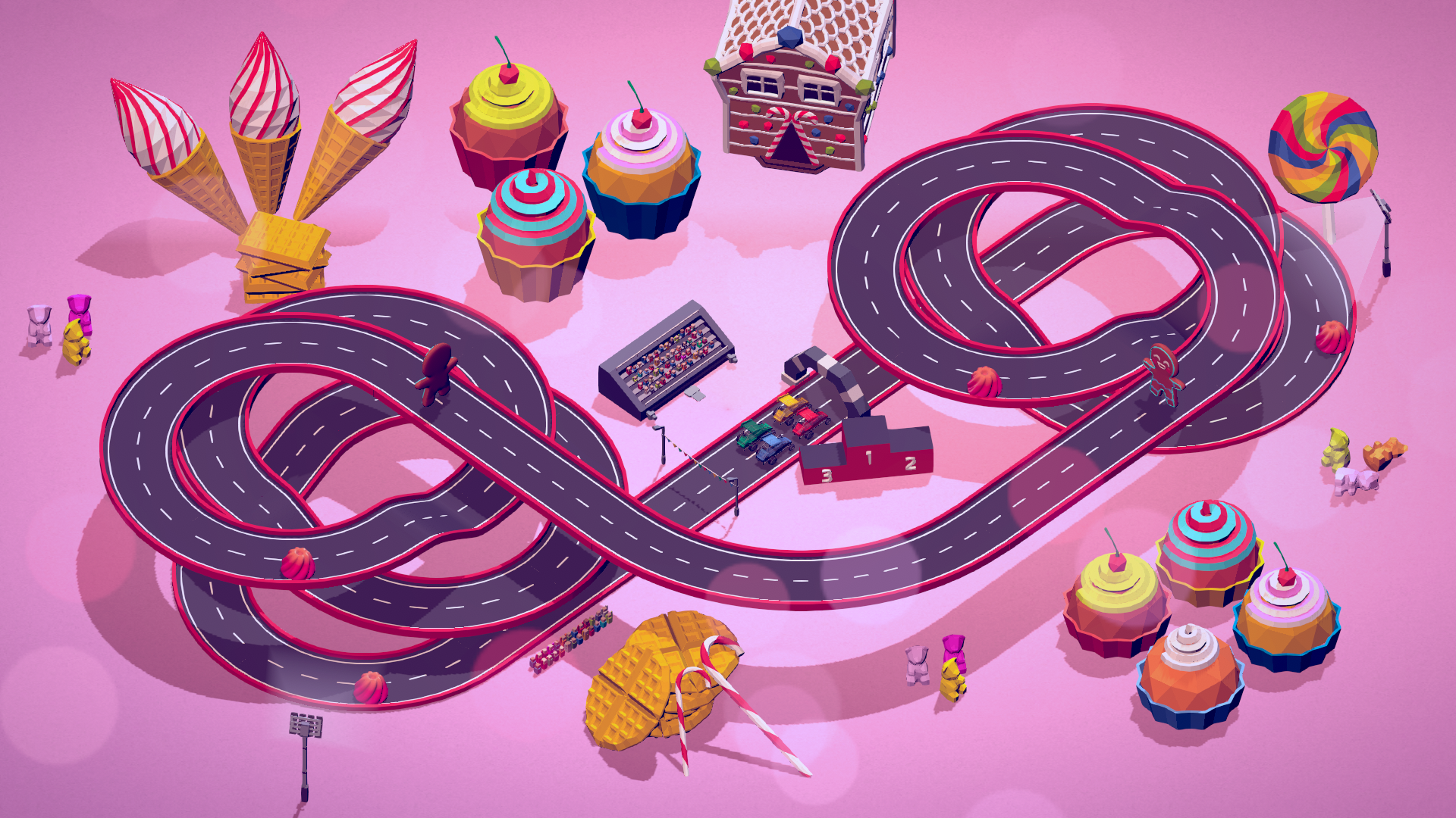
One of the tasks that were particularly challenging was level design. As we wanted to keep the game simple but also very dynamic, we needed to be very creative while designing the tracks in order to make them differ significantly. We also needed to be careful with the size of the tracks, as the game is also available for handheld mode, and on the small screen the bigger tracks could easily become too tiny to see anything on them.
Another task that required a lot of attention was balancing the game. We had to make car statistics and conditions for achievements and unlocking levels work together smoothly, while keeping the difficulty level at medium. As we wanted to make the game attractive for different kinds of players and make it enjoyable for a group of people playing together, we had to keep the game easy enough for kids and elders, as well as challenging for the more advanced gamers. We also made sure that big part of the campaign levels is not too difficult to unlock, to allow fast access to the variety of levels in the party mode.
Last but not least, a challenge that is also worth mentioning is the level editor. We were focused on making it as user friendly as possible while giving the player as much creative freedom as we could. At first, we wanted to give the players the ability to place everything freely on the map, however, it turned out that making a cohesive, closed track, with Nintendo Switch controls, in this mode would take hours and could become frustrating, especially for kids. Finally we opted for dividing the creation process into two major parts: creating a track and placing obstacles. We decided do “guide” the player while placing the track parts, allowing him to choose only between the parts that suit the last placed part – therefore we could avoid creating disappointing tracks that wouldn’t work properly. After closing the track by creating a full loop, the player can place the obstacles freely (or at least as freely as possible to make them work properly on the track). We also added the option of automated decorating, that can be clicked as many times as needed, until the generated decorations suit the player’s taste.
Summing up, working on Little Racer from the designer’s perspective was quite an adventure. Sometimes it really was a race against the clock, as each feature required loads of tests and tweaks in order to provide the best experience possible for the players. However, there’s no better reward than seeing smiles on people faces and hear their laugh while they have fun on the tracks or they let their imagination run wild in the editor.


