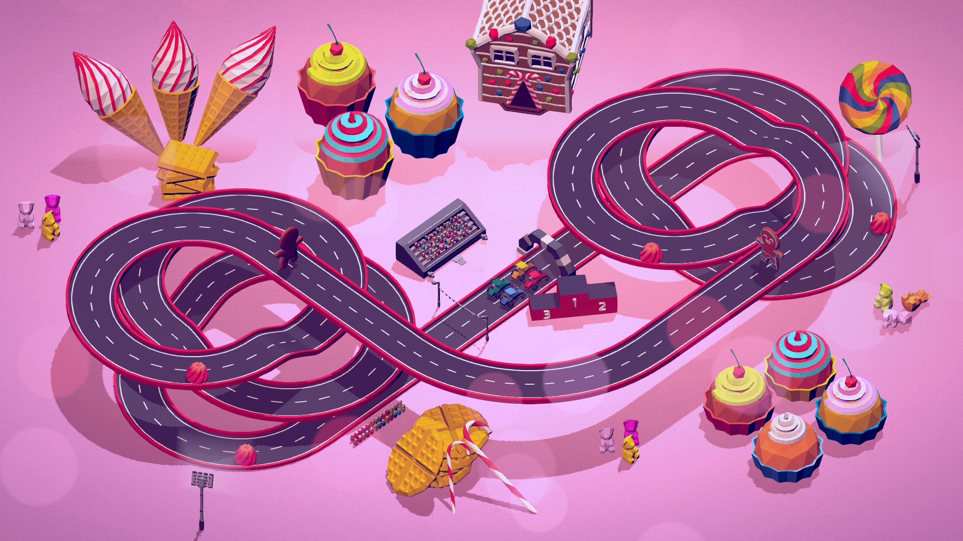
Background
Our main goal was to create an easy to pick, approachable couch multiplayer game for up to four players. Rivals are supposed to win the slot-cars-like race set in a variety of worlds. Graphic simplicity was dictated by the general idea of the game’s casualty.
We’ve decided to set our game in a low-poly setting for the sake of readability. To make a visually clear, low poly game, it was necessary to not use some maps, such as normal or noisy metalness and specular. To recreate the feeling of slot car racing the camera is set above the track, but using perspective view caused problems with visibility. Therefore, we used static, orthographic camera. Level editor allowing players to create their own tracks is one of the main features. Aspects mentioned before had a huge impact on the game’s design and development and I’d like to explain why below.
Cars
Cars take a small part of the game screen, so we had to make them distinguishable. Their shapes vary a lot. Differences between MonsterTruck-inspired car and a Quad make it easy for the player to identify their current position. Obviously that wouldn’t be enough if we didn’t apply different colors assigned to the players.
Almost every 3D asset is painted using only one atlas texture. That greatly shortened the development process and also has a positive impact on the game’s performance. Using flat color with a simple direct light looks decent in low-poly style, but we wanted to achieve tiny details that fulfill general experience. A good example of that case is how fake light and shadows have been implemented in the car’s models.
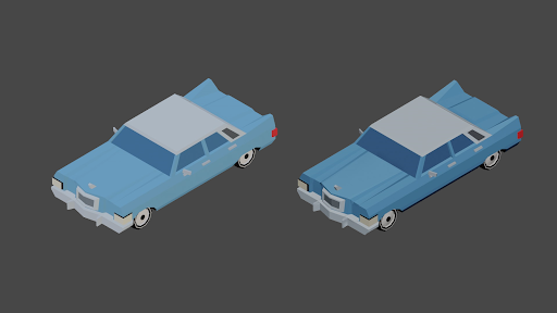
Car on the left side has the body’s UV set in the same place on atlas. It wouldn’t be bad if the game scene contained a complex light system, but we decided not to use it. To solve the problem we placed certain UV parts on the neighboring colors on the atlas. As a result, the car has more contrast, and its shape is more clear. What’s more, using additional light wasn’t necessary.
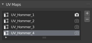
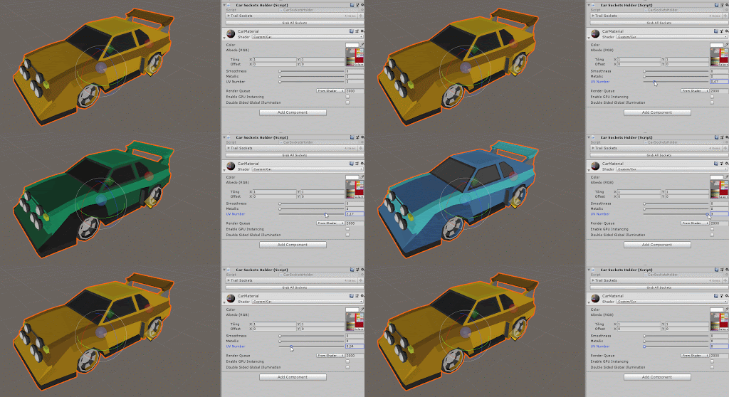
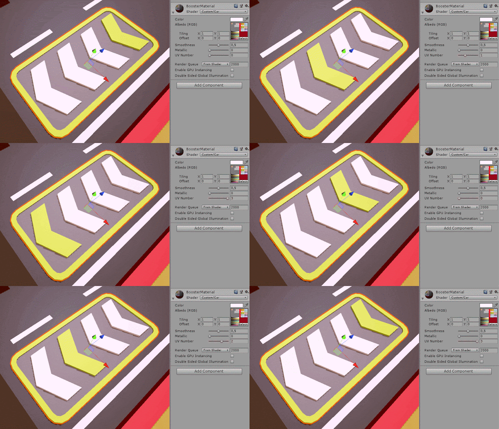
As I mentioned before – almost every 3D object uses the same atlas texture. To change the car’s colors we don’t need a separate model or prefab. We created 4 UV sets of each car and wrote a shader that swaps them. That allows us to reduce the size of the game. What’s more, it’s easy to imitate movement by creating a simple animation, as we did in the booster’s model.
Track components
Players are able to create their own tracks using road parts, obstacles and props. Position of all these objects is dictated by the world’s grid. Every part must be set accordingly to the tiles, that size is 30x30x10. That decision had a great impact on design and development. Although it helped to organize tracks, a few tricky issues appeared. All road parts have to snap perfectly and curve angles have to be precise. Therefore a lot of measurement and tweaking was necessary. Some problems came up with turns and loops, but the hardest part was to create even spaces between lines.
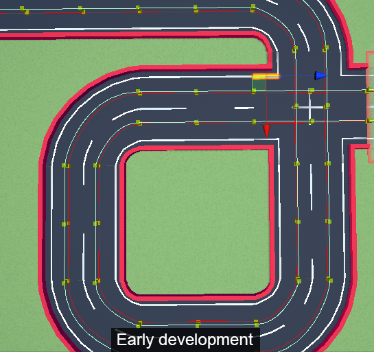
As you can see above, the lines have different lengths. We tried to solve this issue with Unity’s Line Renderer, but that tool doesn’t allow to do it properly. Its bezier controller works a bit clunky and causes trouble on loops and other vertical paths. To solve the problem we rearranged the mesh and added some edge loops along track parts. Even though it doesn’t seem to be difficult, it was a bit tricky to make, especially because of the editor system.
Obstacles
All of the moving obstacles have implemented different mechanics, that make player behave in a certain way. We had to focus on the matter of readability. Obstacles’ models and movement need to be recognizable by the players. Creating animations for animals wasn’t an easy part. The reason why it was difficult is that blocky, low-poly models don’t always bend and morph the way artists wish they did. Adjusting mesh, rig and skinning needed a couple of iterations.
Static obstacles needed some adjustments as well. We needed to simplify the mesh and decrease the amount of tiny details for the sake of readability. To ease the identification process, we added particles. Some of the visual effects are just for decoration (such as rain, snow, confetti), but part of them inform about the state of obstacles or vehicles (lava geyser, exhaust fumes).
Props
Majority of props work on the same principles as the rest of assets. They are textured using the same atlas map and need to fit into the grid size. In the editor props are spawned procedurally – it took some time to organize scripts and meshes properly. The main issue was the trees in basic, cottage and winter levels. Because of the amount of flora we’ve observed frame drops. It’s impossible to add Unity’s Level of Detail system in that case (static, orthographic camera). A baking light map wouldn’t help either (trees are moveable objects – can be hit by cars passing by), so the only reasonable option was to decrease the number of polys. Luckily, lowering trees’ polycount turned out pretty good. The simplifying mesh didn’t make it look worse, but enhanced the game’s framerate. Cutting each tree from ~800 tris to ~650 tris had a huge impact when it comes to the performance.
